Mastering mobile learning: A strategy guide for elearning success
5 minute read
Nowadays people expect to use their phones for elearning. If your elearning isn’t optimized for mobile, it’s not working at all. But don’t panic. Use this handy guide to create a mobile learning strategy that guarantees a seamless smartphone experience. Every single time.

Table of contents
What is mobile learning?
Mobile learning is any learning delivered on a mobile device. That might be a smartphone, a tablet, or even a smart watch.
Usually, though, when people talk about mobile learning, they’re referring to smartphones. That’s because learning needs to work a bit differently when it’s accessed on a small phone screen, so special requirements come into play.
Why mobile learning matters today
With people spending a third of their waking hours on their mobile phones, if your learning’s not getting a look-in, you’re losing out.
Okay, so most of that time is spent scrolling TikTok and Instagram, but when users do make the leap to learning, it truly pays off. Research shows that learning in small bursts on smartphones embeds content in long-term memory and improves job performance.
But that can only happen if your learning is optimized for mobile technology.
Think of it like this: have you ever used your phone to visit one of those websites that’s clearly designed for a big screen? Where you have to zoom in to read text and make the buttons big enough to select? It’s a terrible experience, right?
That’s what poor mobile learning feels like.
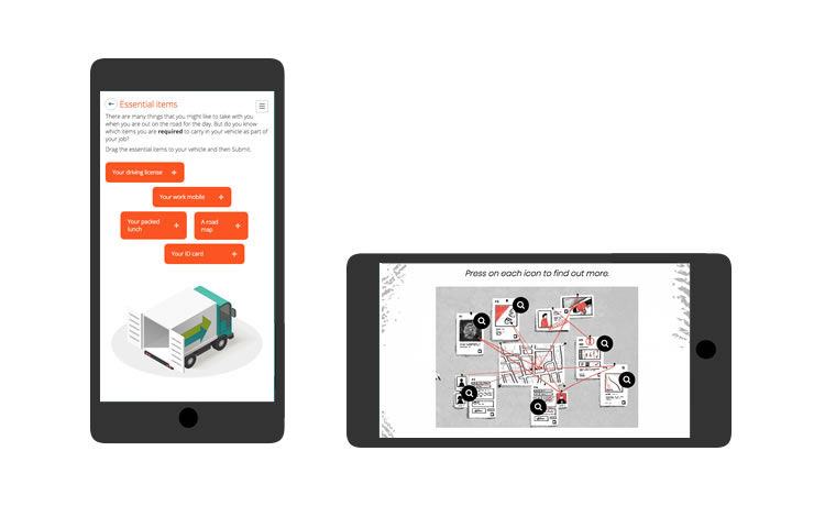
It’s not enough for content to simply be visible on a phone. It has to work properly on a phone. And that’s where responsive design comes in.
What is responsive elearning design?
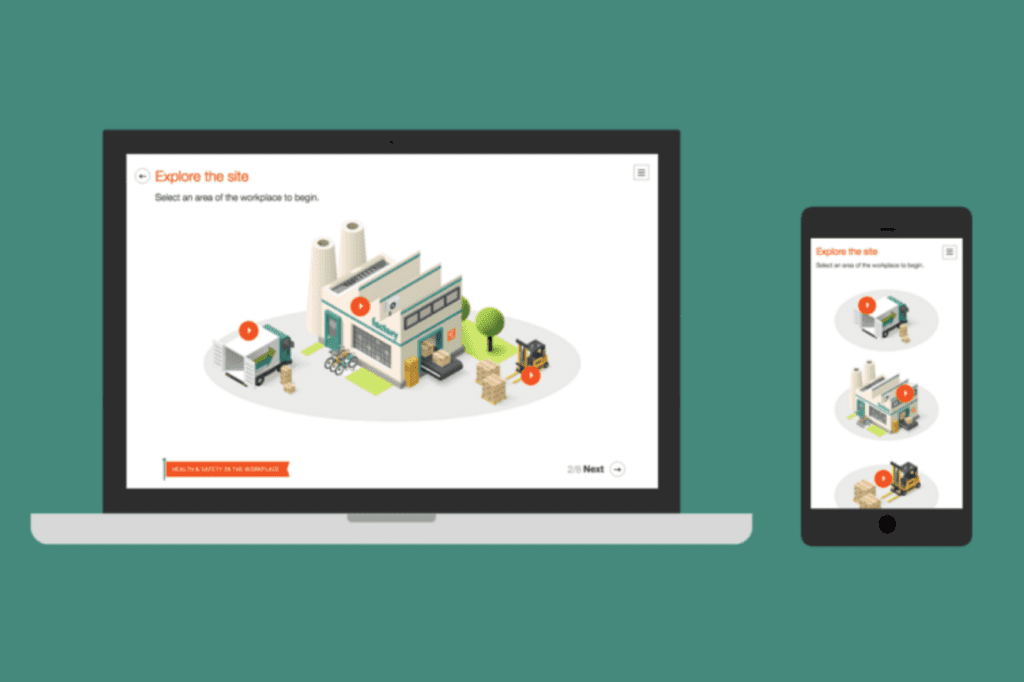
Responsive elearning automatically adjusts to the screen size it’s viewed on. But it’s more than just resizing.
A responsive mobile learning platform might reorder content, swap out images, or simplify interactions to suit smaller screens and touch-based navigation. Done right, it makes the mobile experience every bit as good as traditional learning.
Planning your mobile learning strategy
Before you jump into mobile learning content design, start with a strategy.
- Look back with analytics
If you’ve got access to device usage data on your learning management system, check it out. See how learners have accessed digital learning in the past.
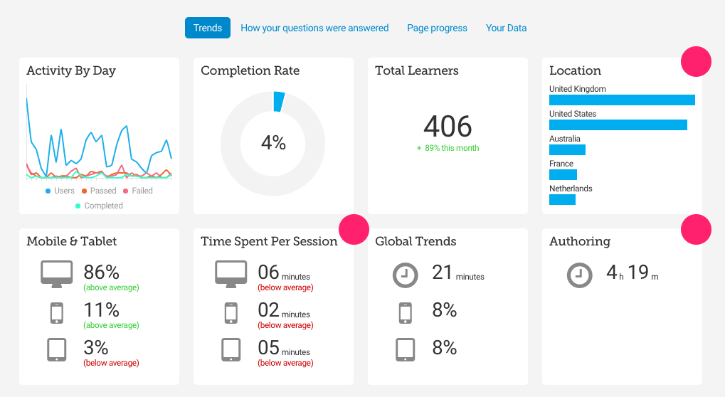
[Device analytics offered by authoring platform Elucidat]
No analytics? Do your own research instead.
If learners haven’t previously made much use of mobile, find out why. Your strategy must address this hurdle.
- Understand what learners want
96% of learners turn to their phones in moments of need, but 44% of them head straight to Google or AI for the answers. How can you make your content their go-to for informal learning instead?
Well, you need to deliver what modern learners are asking for: content that’s simple, relevant, short, and easy to navigate. Factor in the unique needs of your audience, too.
And consider the devices they’re using. Learners issued with work devices? You know the exact specs to design for. Do you have a bring your own device policy? You’re going to need more testers.
- Design mobile-first
Whoever your learners are, your mobile learning strategy must make responsiveness non-negotiable.
So be sure to use an elearning authoring platform that makes mobile-friendly design easy.
Pair this with a mobile-first approach, which means designing for smartphone users first and foremost – because it’s much easier to scale up learning than to scale it down.
Designing for mobile: Best practices and tips
So, you’ve chosen a responsive platform like Elucidat, and you’re all set to design.
Keep these mobile-first tips in mind:
- Embrace the scroll: Mobile users are happy to scroll, so ditch the click-heavy navigation and go for longer, scrollable pages.
- Bite-sized is best: Learners usually spend just 10 minutes on their phone, so keep it short and sweet with microlearning that’s completed in this window.
- Clear the clutter: Simple visuals and minimal clicks are the name of the game when screen real estate is in short supply.
- Make it scannable: Clear headers, short paragraphs, and bulleted lists appeal to on-the-go learners wanting to grab info fast.
- Encourage participation: Interactivity is still essential, so include simple, touch-friendly activities like quiz questions.
Examples of great mobile learning
Let’s see what mobile learning looks like when it’s done right.
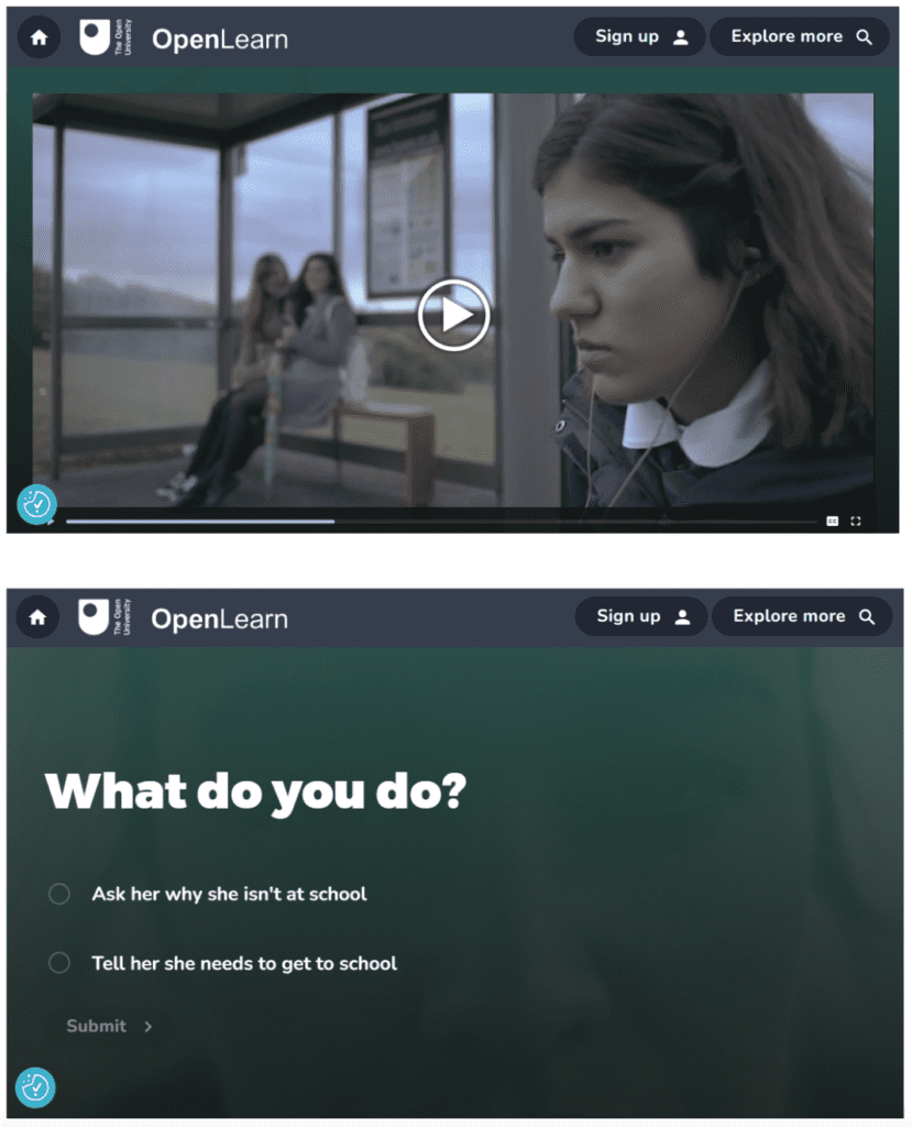
Video-based scenarios
Think videos’s just for desktop? Think again. Video speaks to mobile learners fluent in TikTok and YouTube. Check out this branching scenario that blends compelling stories with simple decision points to keep learners engaged from the get-go.
[The below screenshots are shown on a phone flipped horizontally].
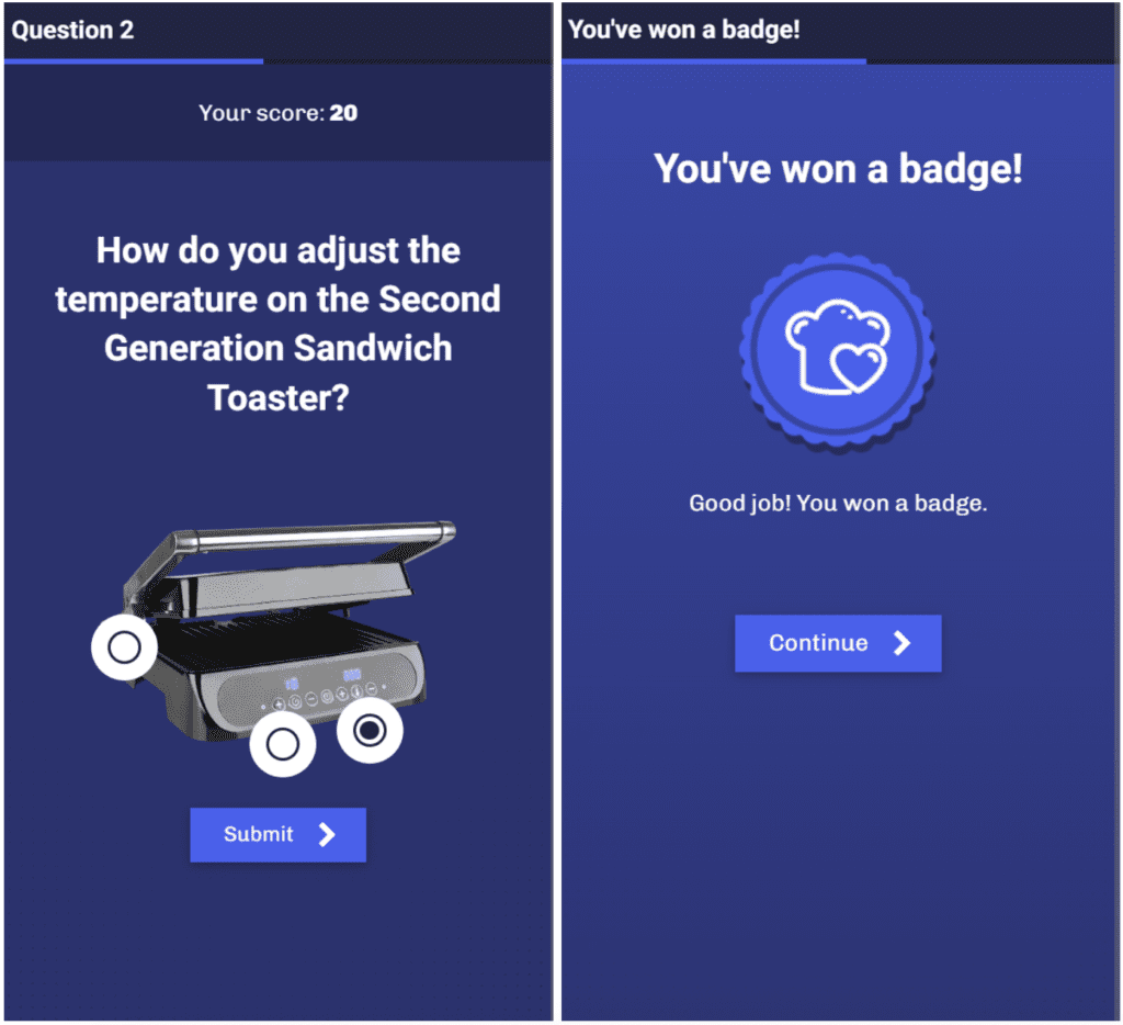
Mobile gamification
People love playing games on their phones. This gamified quiz taps into that with points and rewards that bring a fun twist to simple activities.
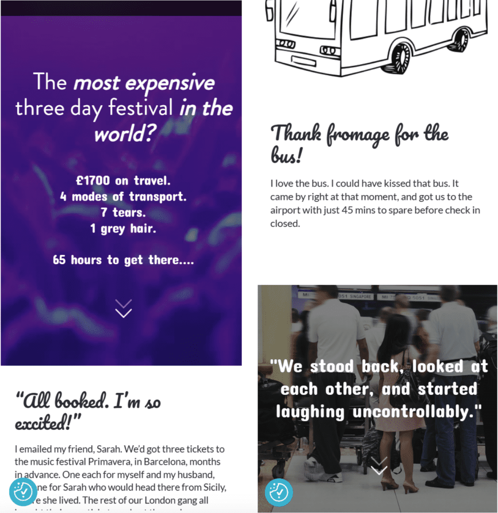
Scrolling adventure
This interactive story is a great example of how smart scrolling design can bring mobile learning to life. Bold visuals, playful fonts, and bite-sized content keep learners engaged from start to finish.
Common mobile learning mistakes to avoid
Even with the best intentions, mobile learning can still miss the mark. Watch out for these three common pitfalls:
- Content overload: Big blocks of text overwhelm small screens. Faced with short attention spans and limited space, it’s crucial to cut to the chase. Focus on the must-know info, broken into digestible chunks.
- Skipping mobile-friendly alternatives: Shrinking down complex graphics or interactions leaves learners squinting and frustrated. If you’re committed to complexity on the big screen, create a mobile-friendly alternative.
- Failing to test on target devices: Even with responsive technology, mobile layouts can still go off-script. Content can reorder unexpectedly, spacing gets messy, and instructions don’t make sense without a mouse. Test on real devices to catch these surprises before your learners do..
Conclusion
These days, mobile learning isn’t a nice-to-have. It’s your front-row seat to learner attention. To get it right, remember to:
- Understand your learners
- Design mobile-first
- Keep content short, simple, and interactive
- Use the right tools (and use them well)
- Test on real devices before going live
For more tips on creating learning experiences that meet your audience’s needs, download the elearning best practice guide or take this course on creating engaging elearning.
Want an authoring platform that makes building mobile learning easy? Try Elucidat. Book a demo and grab a free trial to see how far your mobile content can go.

Get started
Start creating engaging elearning with Elucidat
Book a personalized demo to get started with your 14-day free trial.
Book a demo


