8 brilliant responsive elearning design examples
9 minute read
Designing elearning content to work seamlessly across different devices is a basic requirement these days. Need some inspiration for how to deploy design for elearning? Here are eight responsive elearning design examples that get it right.
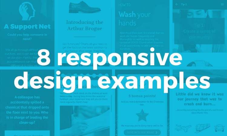
Responsive or Interactive elearning design is no longer a nice-to-have. If you want to reach your learners, elearning designers need to deliver content to all the devices they might choose to use – desktops, laptops, tablets and smartphones. And you need to deliver an equally good (not necessarily exactly the same) digital learning experience across all devices.
What is responsive elearning design and why is it important?
Responsive elearning design (often referred to as ‘mobile-friendly content’) is the practice of designing online courses that look and work great on any device. A responsive elearning course will adapt its sizing, layout, and interactions based on the screen size of the device being used. This ensures the corporate elearning content is always displayed in its most effective format.
For example, a piece of online training may seem perfect on your PC, but once it’s shrunk down on your mobile the same content may appear clunky and distorted. The solution is to apply responsive elearning content design which ensures that the content is user friendly even on mobile devices.
Here are 3 key reasons why responsive elearning design is important:
- Mobile learning is becoming increasingly more popular: Nearly three-quarters of the world will use just their smartphones to access the internet by 2025. In addition, it’s estimated that the Mobile Learning Market revenue will cross 55 Billion USD by 2026.
- A training course needs to be available and accessible to everyone: This includes those outside of the office, who may not have access to a PC.
- Learners can have an optimum online learning experience, regardless of the device they are using: This makes it much more likely for users to take away the key points of the desired learning.
Implementing responsive elearning design will ensure you cover all your bases!
Top 5 tips for awesome responsive elearning design
Let’s take a look at some best practice tips for creating awesome responsive elearning design – recommended by our experts!
1. Embrace the scroll
A single scrolling page focusing on one core element is a simple, yet effective technique for designing elearning courses. Using clear, visual components creates a modern, memorable experience for the learner.
2. Embrace microlearning
Users want information from their mobile quick and fast – so make sure your training does the same! Breaking up your content into digestible, chunks by designing microlearning is a sure-fire way to provide a great learning experience.
3. Reduce the clicks!
It’s no secret, ‘click-through’ courses won’t keep your learners engaged. Keep your training course focused on one action at a time and remove any unnecessary screens or clicks.
4. Visually, less is more
Try not to make your training too content-heavy. Keep it clean, easy to read and easy for your thumbs!
5. Make it easy to scan
The fast-scroll is inevitable, so make sure your key points stand out. Use clear headers, numbered points and icons to grab attention.
You can learn more about effective mobile elearning strategies and how to achieve the best results for your learners in our dedicated article.
Two Characteristics of responsive elearning designs
When applying responsive elearning design you’ll notice a couple of characteristics that help create that seamless user experience:
- Adaptive, ‘mobile-friendly’ responsive elearning content that looks great on any device, ensuring an effective learning experience.
- Easy-to-use corporate elearning interactions that work across all device types, allowing users to engage with content.
Authoring tools for responsive elearning design
There are many elearning authoring tools out there – but they’re not all optimized for responsive design. If you want to create courses that work across multiple devices, be sure to check the tool’s responsive design features first.
Two examples of responsive authoring tools to check out are:
- Elucidat – All courses are fully responsive and work great on any device. Courses can also be edited via a mobile-slider view prior to release
- Articulate 360 Rise – Each course adapts to fit the screen size of the user with the same look and feel.
There are others on the market as well. For more on that, you can compare and review the top authoring tools and software.
8 examples of responsive elearning design

Some of the responsive elearning design examples can be gifted into your Elucidat account (or free trial) so you can see how they’re made and use them as a starting point for your own content!
1. Beautifully simple scrolling pages
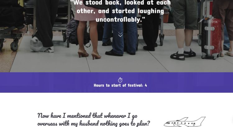
Remember when good elearning design meant not requiring the user to scroll? These days, scrolling can actually be key to creating a brilliant mobile-friendly learning experience. This scenario is a good example of just that.
Why it works:
- It takes its cues from multi-device web pages: beautifully-designed content, cleverly laid out on scrolling pages
- The design makes good use of blocks of color, sub-headings and different fonts to break up the content and lay it out in an easy-to-read, compelling way
- Although it’s text-driven, it’s not text-heavy; even when viewed on a smartphone screen, no chunk of content is more than half a dozen lines long
- The visuals (full-width photo backgrounds and clean, sketch-style graphics) have been chosen for their impact across multiple devices
- Each scrolling page ends with a simple interaction that maintains momentum and sets up a little cliffhanger to make the learner want to continue to the next page
Giftable | Click here to see this scrolling page example
2. Responsive elearning using video
This immersive scenario-driven interactive demonstrates that embracing responsive design doesn’t mean steering clear of multimedia elements.

Why it works:
- The visual menu scales to present the scenarios as a row of images on desktop or a stacked column on mobile – creating an exploratory experience whatever device is being used
- The sequence of interactions used – video followed by single choice questions – creates an impactful experience whether viewed on laptop, tablet or mobile
- This example uses the Rules feature to create branching storylines that reveal consequences tailored to decision points – proving that sophisticated design techniques can pack just as much of a punch on small screens as they do desktops
- A reflective final page summarises the learner’s approach based on their decisions. It’s broken up into different coloured sections to make the different content points stand out.
Click here to go to this elearnign video example
3. Mobile-first design for on-the-job performance support
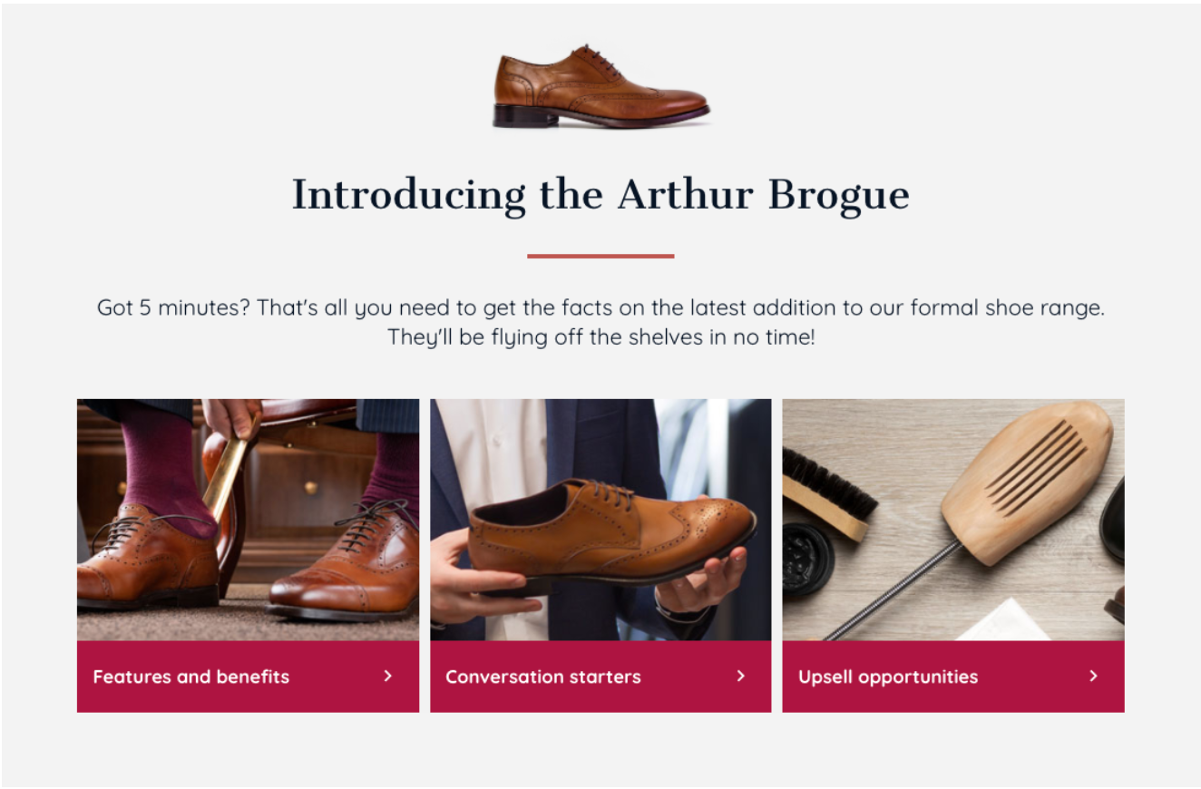
Mobile devices come into their own for on-the-job performance support, like this retail example. When you need to keep staff up-to-date without removing them from the workplace, mobile-first design lets you put practical performance support literally in the palms of their hands.
Why it works:
- This is really all about speed and ease of use – a learner on the shop floor with a customer in front of them can reach the content they need within a couple of taps
- A clear and simple menu, accessible at all times, makes it super easy for the user to find what they need, be that a detail about the product itself or support to make the sale
- Elucidat’s interactions are used wisely and with purpose – they break the content up into micro-chunks, each answering a very specific question
- The home page includes just enough visual detail to engage users accessing the content on a just-in-case basis without slowing down the experience for just-in-time users!
- The content is identical across all screen sizes and it works seamlessly across devices, which is a crucial factor in providing real-time performance support
Giftable | Click here to see this mobile-ready elearning example
4. An interactive one-page resource
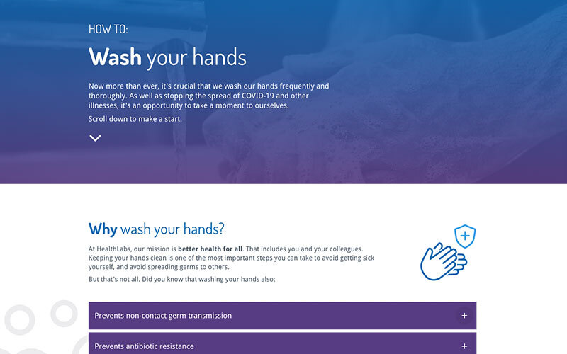
Scrolling designs create an easy to navigate experience across devices, with the ability to present related content on one page rather than forcing learners to click through several. This makes them perfect for explaining short practical processes, like in this quick guide to handwashing.
Why it works:
- A single page that pulls together the core facts – what learners need to do, why they need to do it and how to go about it shows that digital learning can be short and simple, but still valuable
- It grabs and keeps attention at any screen size with a bold header, clearly labeled sections and relevant iconography throughout
- The scrolling design is perfect for explaining a linear process for the first time as it shows the whole process on one page
- An added bonus is that it makes it easy for learners to skim, no matter the device they’re using, if they need a quick refresher later
Giftable | Click here to see this interactive on-page example
5. Robust assessments to suit any device
Although we’re advocates of using scrolling pages where they enhance the learning experience, there will always be some situations where shorter pages can be best – like assessments. You can create a truly robust test that works for multiple devices by choosing your interactions carefully and making the most of features like question pools within your interactive elearning design.
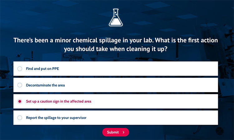
Why it works:
- A range of mobile-friendly question types are used to keep the learner engaged and avoid risking repetition
- Each question stands out by taking center stage on its own page. Separating them out one by one also gives a sense of pause and reflection between each question
- An assessment with short pages like this would work well when combined with longer scrolling pages for theory content too – it helps the learner to orientate themselves in the course by using navigation that best suits different types of learning experiences
Giftable | Click here to see compliance test with question pools example
6. Applying responsive design to microlearning
Microlearning is great for delivering short, sharp bursts of learning. Its short length makes it particularly suited to those learning on mobile devices – by keeping responsive design in mind, microlearning modules can give learners the knowledge they need in an easy to access, quick to navigate format.
This example on how to manage remote teams shows how a responsive microlearning module can support the process of skill development.
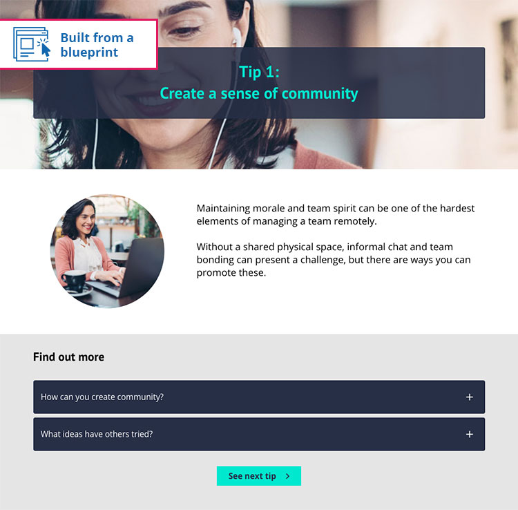
Why it works:
- After kicking off with an attention-grabbing statistic about remote teams, 5 top tips are presented on dedicated pages. This consistent design approach helps to deliver content in short bursts that are easy to navigate, whatever device is being used
- Each page uses clear visual sections to break up the content and make it easier to scan at a glance
- The interactions used work well on both desktops and mobile devices – reflective questions, text overviews and accordions that reveal how to take the learning further. All easy to interact with even on a small mobile screen!
Ready-made templates | Click here to see this microlearning example
7. Using game-like features in responsive courses
Audiences today are used to playing games on whatever device is handy – so don’t be afraid to spice up your responsive elearning design with a touch of gamification, as shown in this Christmas quiz.

Why it works:
- A variety of question types (all available in Elucidat) have been used to create an engaging experience, with each interaction designed to work seamlessly across a range of screen sizes
- Game-like features have been chosen carefully to ensure they enhance the experience across devices, such as timers, points, levels and badges
Click here to go to this game-like features example
8. Make onboarding easier
New starters have a lot to take in those first few days in their role, but you can ease the learning curve by offering quick, focussed overviews. Single scrolling pages are great for upskilling learners on key tasks quickly – they can easily refer back to the content on their phone, tablet or laptop.
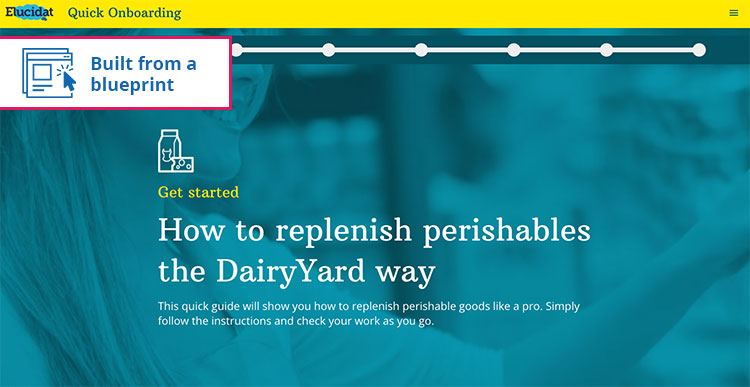
Why it works:
- Practical tasks are broken down into clear, simple steps, with a mix of background colours and images dividing the page into easy to navigate sections
- In-page navigation makes it easy for learners to complete each part of the scrolling page
Ready-made templates | Click here to see this quick onboarding example
Start creating responsive elearning
These responsive elearning design examples show that delivering to multiple devices no longer means working to the lowest common denominator! For more elearning best practice tips, check out our guide.
Interested in how you can improve your elearning content design for tablets and smartphones? Ask us for a free trial of Elucidat and see what you can do.

Get started
Start creating engaging elearning with Elucidat
Book a personalized demo to get started with your 14-day free trial.
Book a demo


